One visual element on a book cover that screams "self-published" is a title in a basic text font, a font that comes with the software the cover was designed in. I wanted to avoid that trap when designing the cover for my steampunk romance novel, The Name I Chose.
As an alternative to your software's basic fonts, you can download fonts free from Google Fonts. Or browse and buy a specialty font from font services such as Design Cuts. If you've acquired design software by subscribing to Adobe's Creative Cloud, you have access to Adobe's specialty fonts.
However, I was mightily inspired by the cover of a nonfiction book about all things Steampunk. I decided to play with a basic font in Illustrator to achieve a title font similar to that used for The Art of Steampunk.

Pause to admire its beautiful cover. The book is just as beautiful inside. It contains photos of steampunk art in various media, including lighting designed by the book's author, Art Donovan. If you love steampunk, or you seek inspiration for your fictional world-in-progress, I highly recommend you add The Art of Steampunk to your library.
Ok, here's a loose tutorial of my basic-font customization in Adobe Illustrator. My title font was Gill Sans Ultra Bold. Pretty Basic. I turned the text into art by accessing Illustrator's Create Outlines option via the Type menu, as shown in this next screenshot.


Create Outline turns a text letter into a shape with nodes, or anchor points. The open arrow, a basic tool, allows me to select an individual anchor point and pull it. I also created new nodes (anchor points) using the add-anchor-point version of the basic pen tool. Illustrator's basic tool palette is shown in this next screenshot.

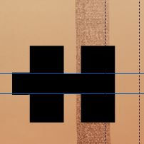
I wanted my created outlines to be evenly spaced so I used guides. This is done by accessing the Show Rulers and Show Guides features via the View menu. Then I clicked and dragged guides from the rulers at the top and side of my Illustrator work space.

The View menu also allows you to view your design as an outline -- this isn't the same thing as changing your text to a graphic element with Create Outlines via the Type menu. Rather, View > Outline (shown in the next screenshot) just turns your design into a wireframe so you can work undistracted by your design's patterns and colors.


And that's it. Just pull, add, and customize until you have a text-style that doesn't look basic. Call me crazy, but I think it's fun. Here's my finished product. Not bad, eh?
I chose this cover design over my other ideas because it gives a sense of the story's setting. I'm particularly tickled that the drapery superimposes transparently over the factory stovepipe, symbolic of contrasting worlds colliding and Philomena's personal world changing.
If you'd like to explore today's topic further, here's a related YouTube tutorial by Digital Design Tips.
I wish you happiness in your creative endeavors!
Comments